Keith. I could talk about your work, talk about you, endlessly. You are the original great equalizer. The original plays-with-his-shapes and plays-with-his-colors the way that no one has since been able to replicate. The original gone too soon. Your dance inspires me.
Keith used to dance while he painted, used to paint while he danced. The two actions intrinsic and inextricable–painting as dance, organic and involuntary. While painting any of these large scale works–a tarp, a room, a wall–Keith’d turn up the music too loud and use a single line to connect every THING to everything else. In making that line, that continuous flow of paint or ink, he choreographed a ballet and a mambo and a waltz, all at once. That line, so audacious in its boldness and its weight, became Haring’s trademark and his vehicle. The vehicle to convey the feelings that were too big to keep in and which instead he spilled out over blighted urban parks, onto subway stations’ walls, and even onto bodies. I’ve tried, on numerous occasions, to reproduce a line like that and my hand does not have the confidence of his; I stop and start too often, and despite my best efforts to control the shakes, my lines are scrabbly and scritchy. That line effortlessly expresses kindness, anger, hope, and fear, and it is legible the world over, its message language-less and simultaneously language-full. Chocolate Buddha #1 from 1989 is my pick of the week.
Peanut Butter and Glitter
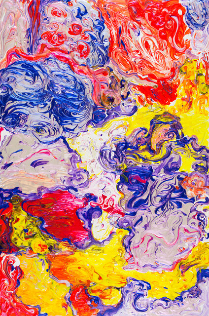
The Italians have such wonderful things: La Dolce Vita!, gelato, language that tastes like candy, wines that make EVERYTHING taste like candy, birthplace of the Renaissance, and many, many, many, of art history’s most effusive terms. Everyone learns, in Art History 101, about contrapposto, a positioning of the legs as if one were mid-stride, found in sculpture dating as early as Ancient Greece all the way to modern-day, which serves to both create a dynamism of movement and also as a subtle balancing-tool. Italian can also claim chiaroscuro (a quality of light and dark in paintings), sfumato (a filmy, smoky-like atmosphere in other paintings), and finally, my favorite, impasto. Impasto describes the way that paint is built up, the texture of visible brushstrokes, the physical shape the paint takes as it is layered and scraped and piled onto a canvas. Impasto reminds me of taffy. Of delicate peaks of whipped cream. Of peanut butter plopped onto a piece of bread. Impasto proves that paint is not only a vehicle for imagery, but also a tool to shape that imagery in a tangible, three-dimensional way.
Painter cum performance artist cum actor, Simone Gad, understands impasto better than most and spreads layer after layer of acrylic paint (and glitter! Oh my god, glitter!), to give her paintings real heft and depth. The canvases are alive with color and shape that make me want to reach out and stick my hand in it to see what that world might feel like. She captures the kitsch and the neons and the vibrant textures of LA’s Chinatown with vivid and fearless abandon. Simone’s painting, Black Dragon Society, delights me, and it’s my pick of the week.
Doggiest of Days
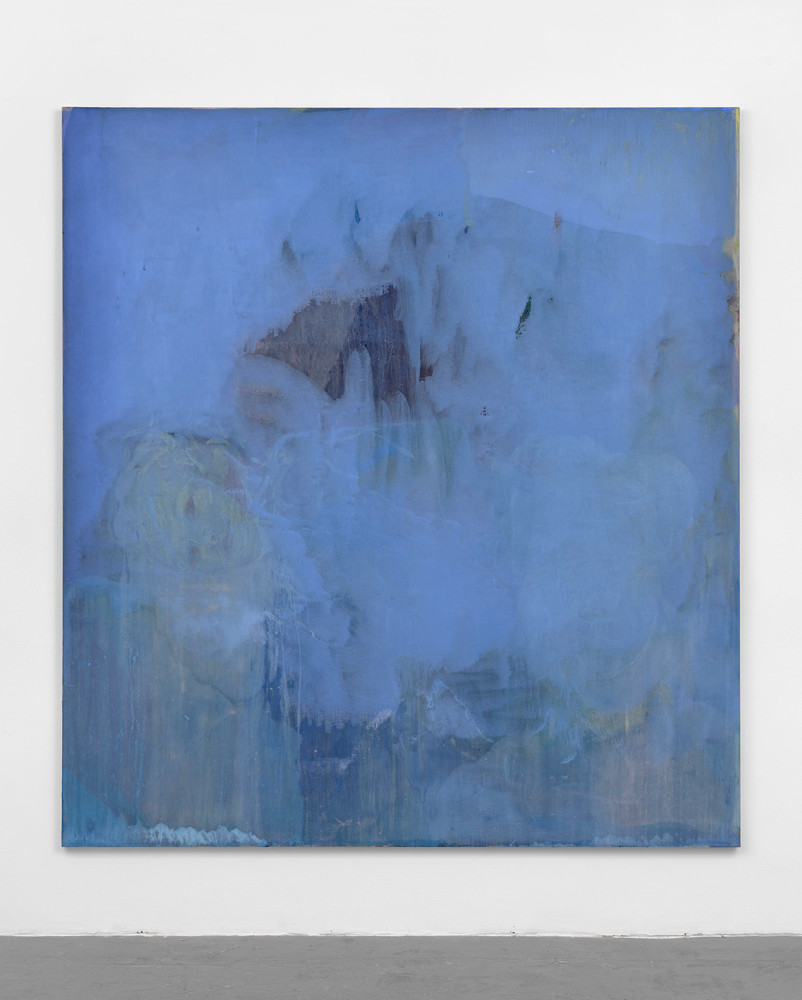
We’ve entered that funny point of summertime, some call it the Dog Days, I still refer to it as pre-season as all through school I played on the tennis team and our pre-season to the regular season would start around now. Whatever you call it, and wherever you’re from, you know that these are days whose heat make you want to strip down to your ribcage. These are days whose light is saccharine sweet and air is heavy and syrupy like honey. These days are no good for anything but dazing in the shade of an overgrown tree in the backyard, flat on your back, limbs thrown wide, considering the white-blue sky overhead.
Sometimes there are clouds to make shapes out of, but mostly, all there is is to watch the leaves of that tree up there, shimmering in the heat and ruffling in the breeze. No photograph or picture could better encapsulate these Dog Days than John Kilduff’s Under the Olive Tree #1. Experimenting with the interplay of spray paint, acrylic, and oil all together, John captures the searing heat and hallucinogenic-quality of the overhanging leaves, masterfully. I can think of no more appropriate piece to celebrate this week than Under the Olive Tree #1.
Victoria Morton
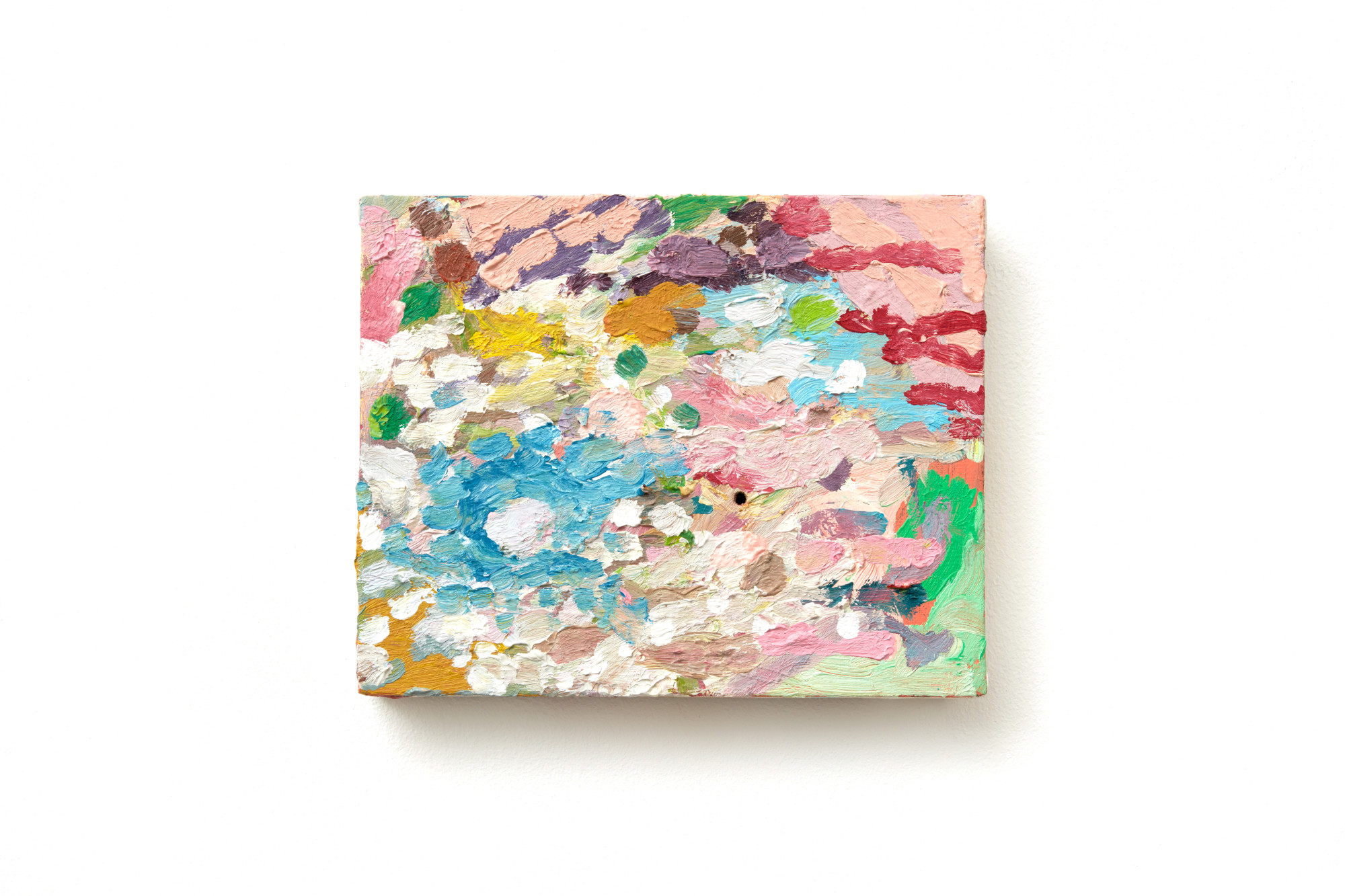
There is something about the tactile surface of a painting that I love. Something so tangible and sexy in the way paint is built up, layered, made to stand out from its surface, as if it cannot be contained within the boundaries of two dimensional space. It feels almost like watching the artist work in front of you, watching them make decisions and marks and erasures, watching their arm arc to create a shape, it is positively intimate. Impasto. Im-PAS-to. Im-pas-TO. IM-pas-to. Even the word feels bouncy, like bubblegum in my mouth, like taffy-pulling, like peaks of whipped cream. That’s what that is called, the paint that has physical shape in which brushstrokes and palette knife scratches are visible. The word “impasto” is derived from the Italian word for “paste”, you get the idea. The Italians got it right. The Italians always get it right.
I think this appreciation has a great deal to do with the fact that I am utterly incapable of putting brush to canvas and creating anything I like more than the blank, unmarked canvas itself. It’s true. I agonize over every brushstroke, dislike every gesture, am intrinsically unsuited to painting a picture. My inability to experiment, to get out of my own way and out of my head has engendered within me an awe of those who are able.
I stumbled–I like the idea of stumbling, I feel like that’s how I learn about a number of artists these days, by forming no set itinerary or intention and just wandering until I literally trip on something that makes me pause–on Victoria Morton’s work at an art fair last year and immediately fell for her brushwork and for the large swaths and washes of rich color laid to suggest volume and shape. Some pictures are geometric, unstudied and unpracticed, others bear faint hints of figures and pointillist dots. I simultaneously admire and envy her ease with a brush.
Check out some of my favorites below, and be sure to visit her Insta for the latest. Victoria Morton is currently represented by Sadie Coles HQ in London.
The Magician
When I was a child I had a recurrent dream. I must have been very young, because I remember still feeling that adults were very big and I was very small. I don't recall much of the dream only that the adults in it used to appear with hugely distorted proportions–pin-sized heads on normal-sized, torsos swinging colossal arms around. I can clearly remember the perspective from which I viewed them as well; I was always looking up at them, as if from a bed, and they, in turn, seemed to peer down at me. I don’t recall being afraid, but I don’t think that I was amused either, just terribly confused at the “grownups'” very apparent disfiguration that no one other than myself appeared to notice.
When I discovered Louise Bonnet (b. 1970, Geneva) and her paintings, I was at first thoroughly charmed by them. I had been wandering through an art fair for the better part of the day and was beginning to feel “art sick”. Namely, I was hot, hungry, feeling completely overstimulated by the barrage of images and completely underwhelmed by their quality, and I was getting very, very bored. Simply put, I was thisclose to calling it quits. However, a booth bearing a single painting of Bonnet’s caught my eye. The painting, The Magician (2017), depicts a figure with comically overlarge and crazily unbalanced features, shrouded by a curtain of their own hair, stretching a piece of rope between two fingers. The image is fairly simplistic, but as I spent more time with it the veil of the painting’s humor began to fall away; behind it I found a representation of those same feelings I experienced in my childhood dreams. I felt neither fear nor amusement, horror nor entertainment, but prudent recognition of something I barely recognized myself. This is the space in which I believe art’s very essence lies, in the ability to speak to you or to a condition or to an experience in ways where speech falls short. The messaging behind an artwork does not itself need to be enlightening in order to succeed, it need only to speak to its viewer in a manner that could otherwise not be communicated.
Bonnet currently shows with Nino Mier Gallery in LA where an exhibition of her new work opens March 24.
Casey Gray
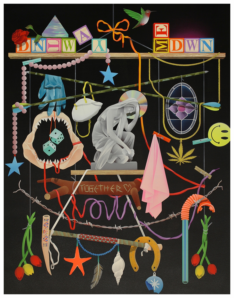
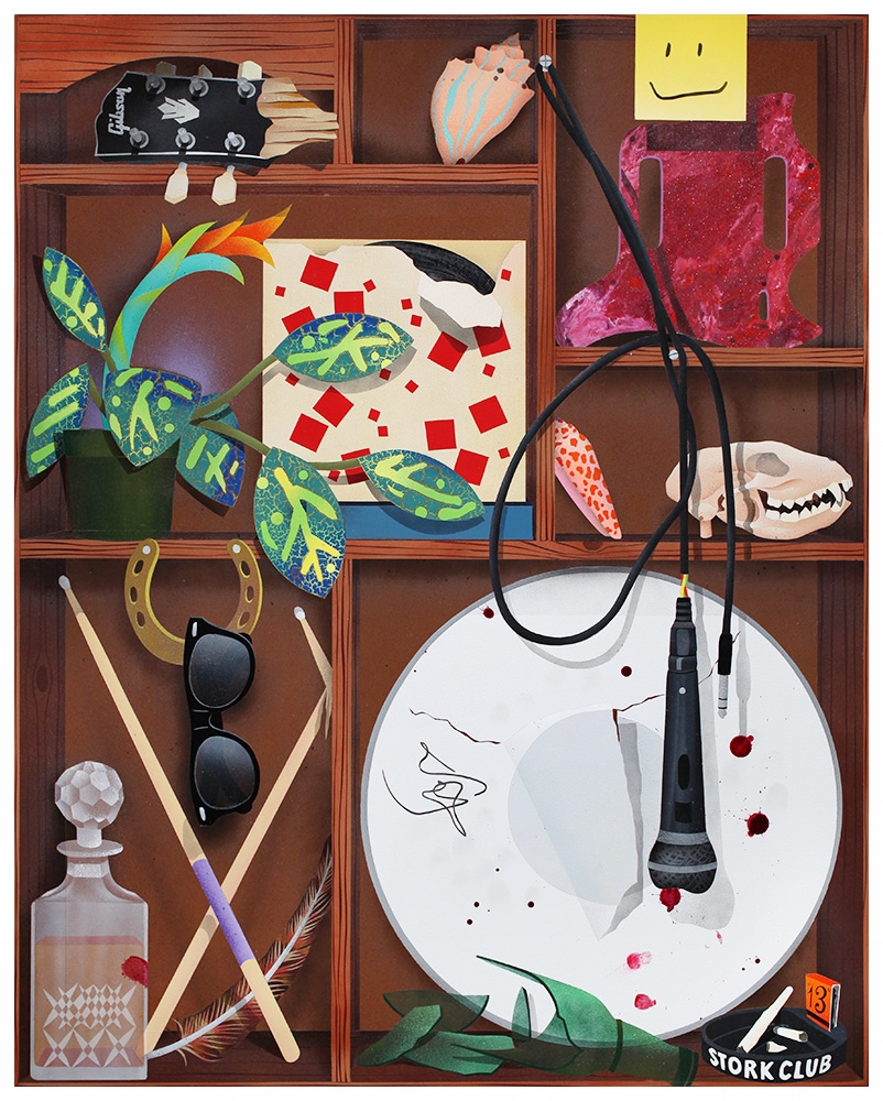
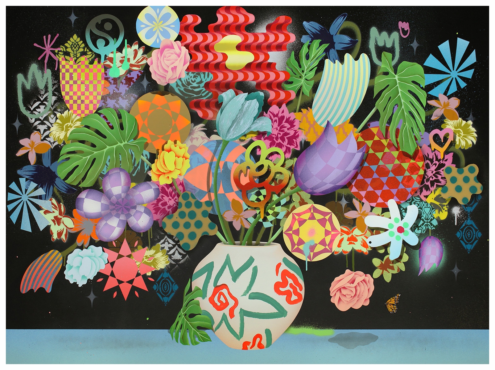
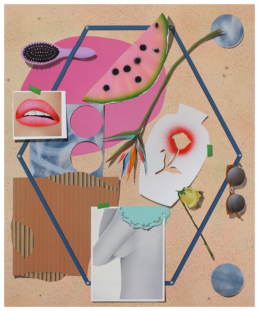
Wandering through the internet a few days or weeks ago, I happened upon Casey Gray. Initially, what caught my eye was his use of color–vibrant, expert, and in-your-face–but upon closer examination, and after having made my way through his website and portfolio, I found that there was a great deal more to Gray's work than color alone. Coupled with nearly flawless technique of aerosol enamels, acrylics, and glitter (!), is an imagery that belies its banality. Plants and post-its, sunglasses and children's blocks, shoelaces and construction paper, create works that are fully-formed, self-aware, and historically referential in a manner that skips over the derivative and into the masterful. I am captivated by both Gray's subject matter and his media.
*all imagery courtesy of the artist, check out Casey Gray's site HERE